Use this data visualization style guide to create a uniform look and feel to all of Tax Policy Center’s charts and graphs. This site contains guidelines that are in line with data visualization best practices and proven design principles. It also eliminates the burden of design and color decisions when creating charts.
These guidelines are primarily for publishing charts to the website. Minor sizing and typographic adjustments need to be made to insert charts into documents.
The links below will always feature the most recent TPC templates. Please use them whenever you start a new project.
Also remember that if TPC is posting a publication, you need to fill out a TPC R&R .
Note: TPC's templates have recently been updated.
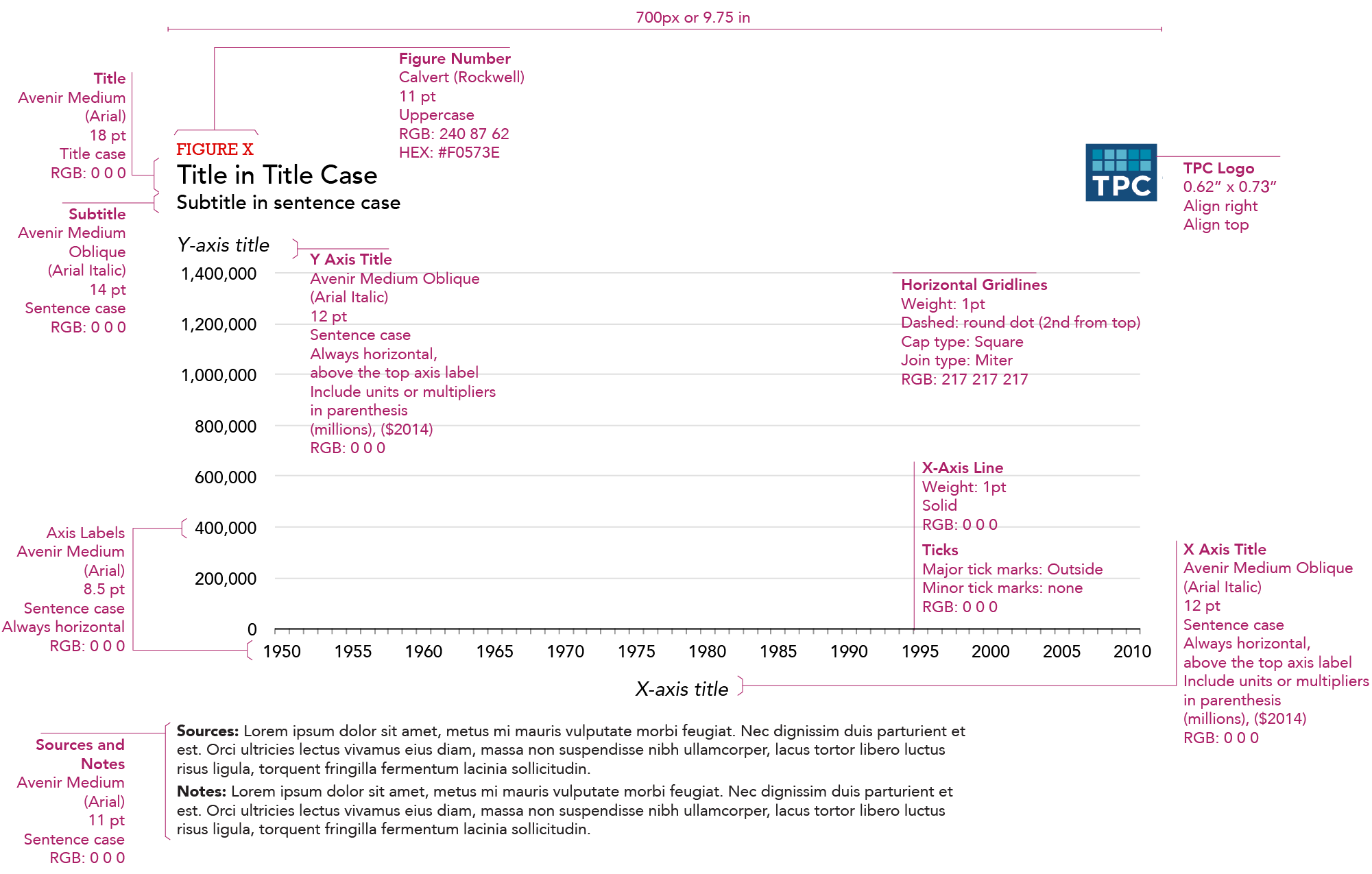
Taxpolicycenter.org uses the fonts Avenir LT Pro 55 Roman and Calvert. When possible, those fonts should also be used to create charts. If the Avenir LT Pro font family is not installed on your computer, please download the font here. If Calvert is not installed, Rockwell is a good replacement (Calvert should be used sparingly in charts as it is on the site). Good chart typography creates a hierarchy among elements and guides the reader through the visual.
Typeface (Alternative) |
Web Size |
Print Size |
Case |
Color |
Notes |
|
Figure number |
Calvert (Rockwell) |
11 |
8 |
ALL CAPS |
#DD0806 or rgb(221, 8, 6) |
|
Title |
Avenir LT Pro 55 Roman |
18 |
12 |
Title Case |
#000000 or rgb(0,0,0) |
The main point of the chart. Try to keep shorter than two lines and avoid qualifiers. |
Subtitle |
Avenir LT Pro 55 Roman |
14 |
9.5 |
Sentence case |
#000000 or rgb(0,0,0) |
Use this to add qualifiers or further clarification to the title. |
X and Y axis titles |
Avenir LT Pro 55 Roman Oblique (Italic) |
12 |
8.5 |
Sentence case |
#000000 or rgb(0,0,0) |
Always horizontal, above the top axis label Include units or multipliers in parenthesis (millions), ($2014) |
X and Y axis labels |
Avenir LT Pro 55 Roman |
12 |
8.5 |
Sentence case |
#000000 or rgb(0,0,0) |
Always horizontal, avoid units or multipliers. Those should be added to the axis title in parenthesis |
Key labels |
Avenir LT Pro 55 Roman |
12 |
9.5 |
Sentence case |
#000000 or rgb(0,0,0) |
Always horizontal. Avoid redundant key labels if possible. |
Direct labels |
Avenir LT Pro 55 Roman |
12 |
9.5 |
Sentence case |
#000000 or rgb(0,0,0) |
Use for line or column charts with three or fewer series. |
Data-point label |
Avenir LT Pro 55 Roman |
11 |
8.5 |
Sentence case |
#000000 or rgb(0,0,0) |
Always horizontal. No units or multipliers. Only directly label columns if there are fewer than 10 total columns in the chart. |
Source and Notes |
Avenir LT Pro 55 Roman |
11 |
8 |
Sentence case |
#000000 or rgb(0,0,0) |
Bold “Source:” and “Notes:” as well as any statistical significance indicators. |
The main content well on TPC publications is approximately 6.75” wide in Excel. Because Excel’s chart title and subtitle fields are limiting in terms of formatting, we use a regular text box for all the text at the top of the graphic, as well as the source and notes text at the bottom. We also include a TPC logo in the upper-right corner of the figure so that when media members copy-paste our charts into their stories, TPC’s brand is on them. If you use the add-in tool, the logo and chart parts will automatically size properly.
Right click and copy the logo above to use in your charts. You should not have to resize the logo. Select the chart, select edit -> paste, or use control+v, and move the logo into the upper-right corner. Make sure your chart is the proper size before pasting the logo. If you resize the chart after pasting, it will distort the logo.
TPCs main colors are deep blue, teal, black and gray. Poppy is used as a highlight color throughout the new taxpolicycenter.org web site.
When selecting colors for charts and graphs, we must first consider the type of data we are presenting. Usually, data can be grouped into one of two main groups: categorical or sequential.
Categorical palettes are best when you want to distinguish discrete chunks of data that do not have an inherent ordering.
Sequential color mapping is appropriate when data range from relatively low or uninteresting values to relatively high or interesting values. For sequential data, it’s better to use a palette that has a relatively subtle shift in hue accompanied by a large shift in brightness and saturation. This approach naturally draws the eye to the relatively important parts of the data. Sequential colors are used for sequential groups (not necessarily the way the data trends). So age groups young to old and date ranges might be something that I use sequential colors for.
For more information about the subtleties of color, refer to this collection of blog posts from Visual.ly.
The following color combinations are intended to take some of the guess work out of the process of assigning colors to charts. They're only examples, and can be mixed-and-matched depending on the story you are trying to tell with your data.
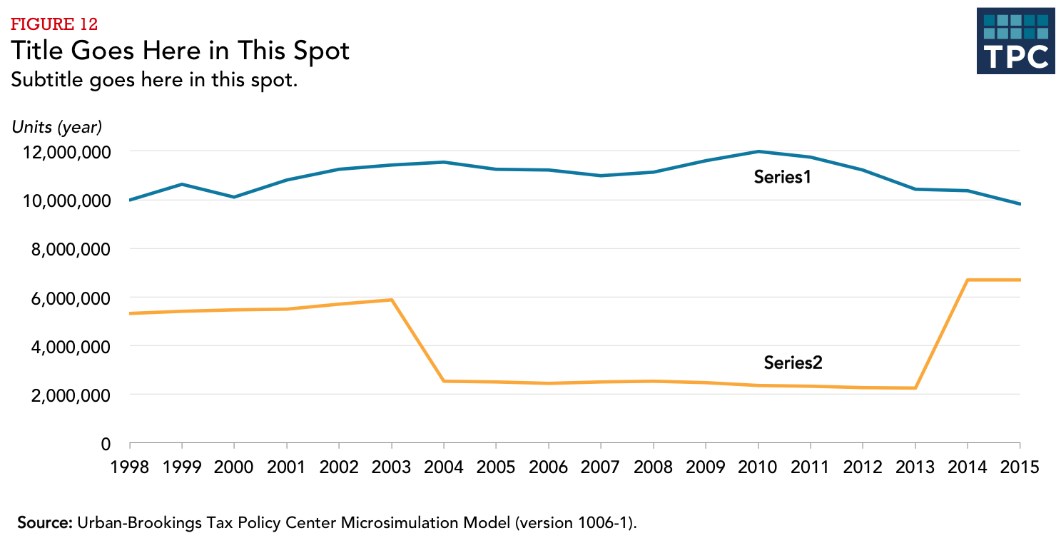
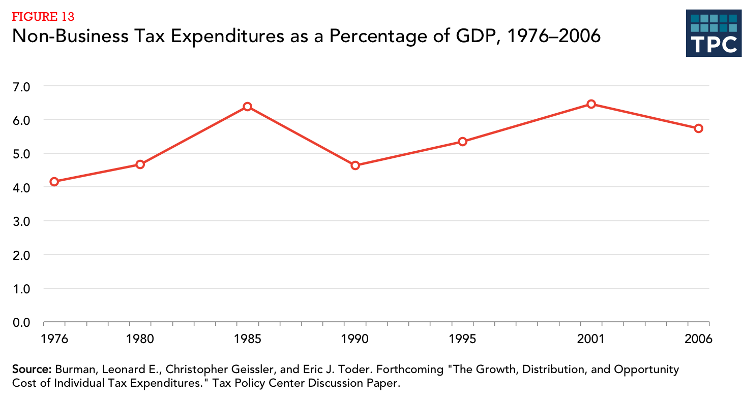
The following examples use the styles and colors to illustrate common chart types. To deconstruct any example, download the the master Excel file.
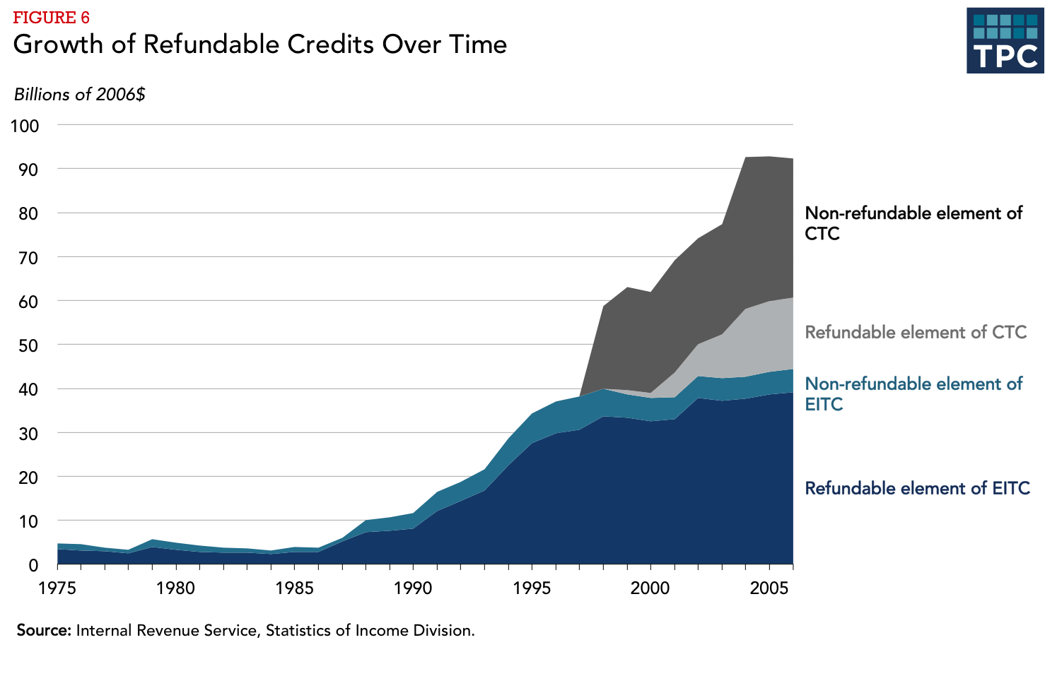
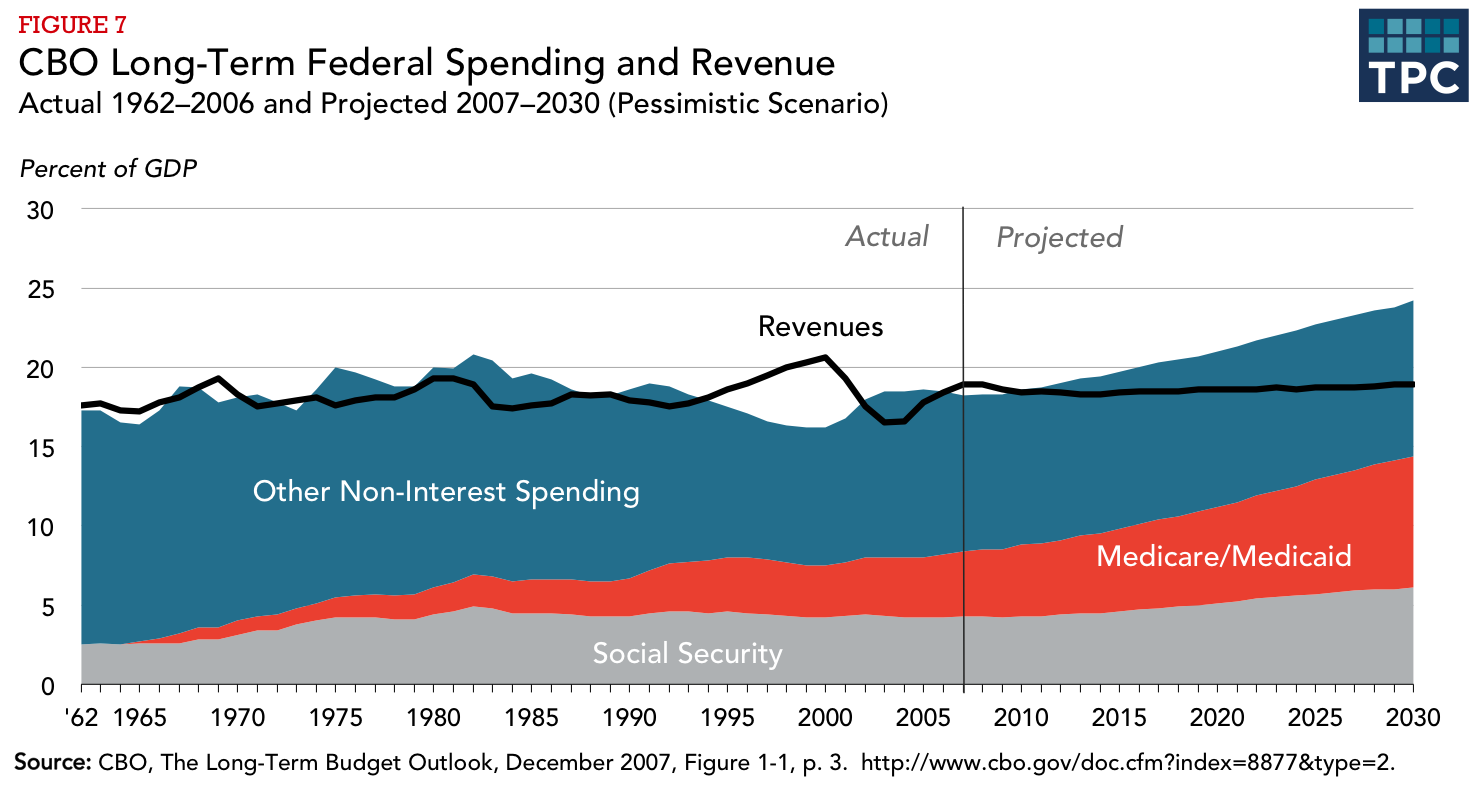
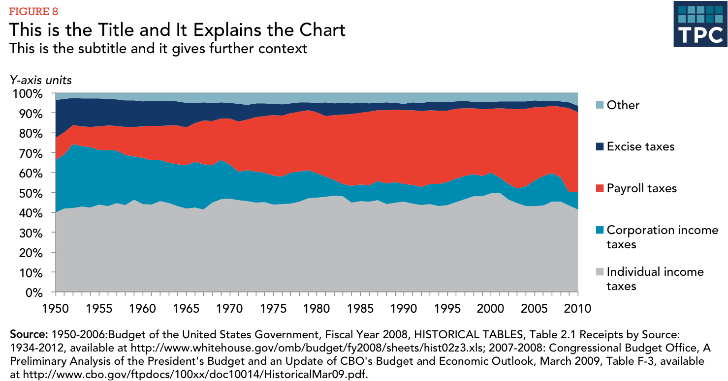
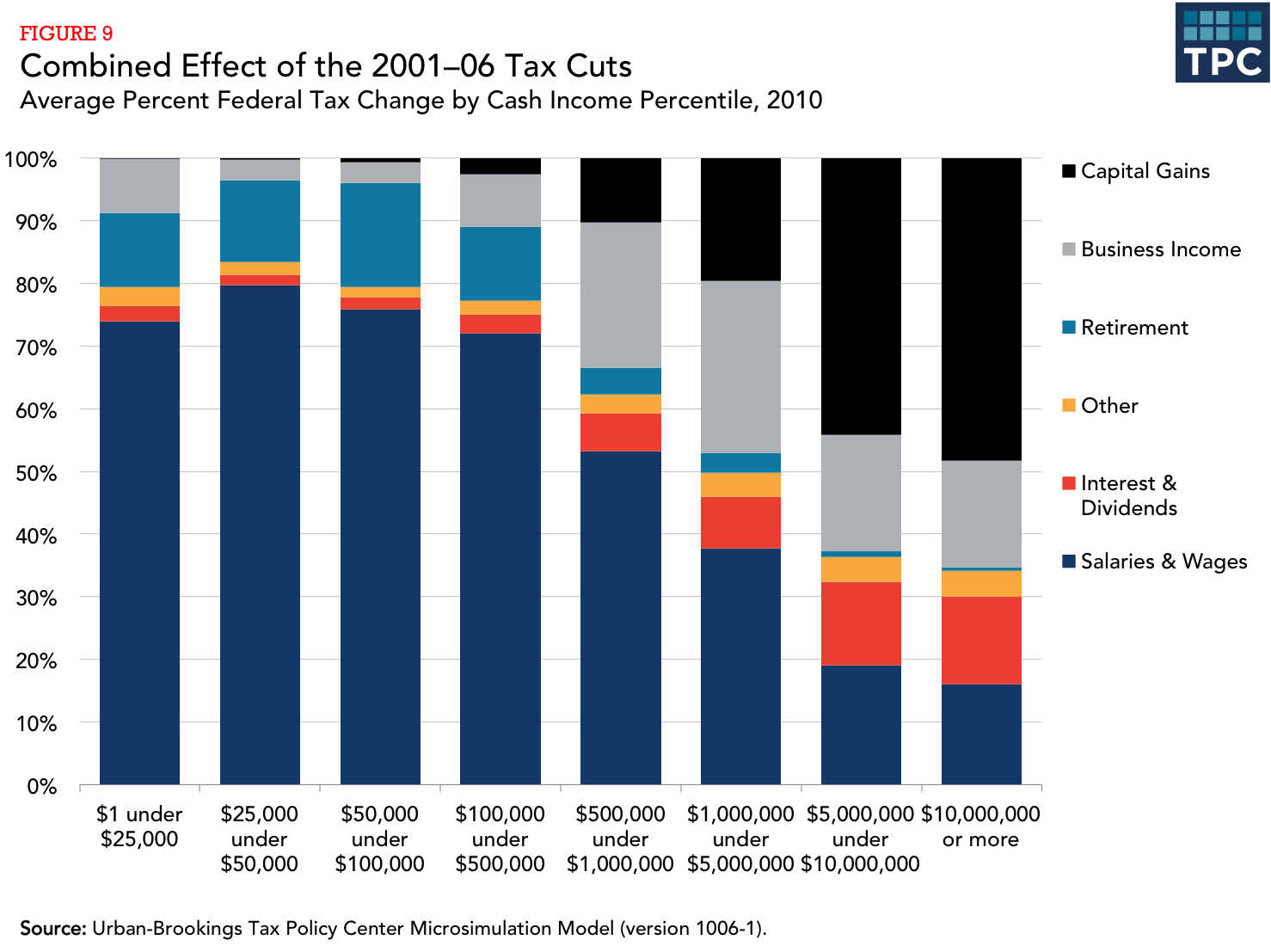
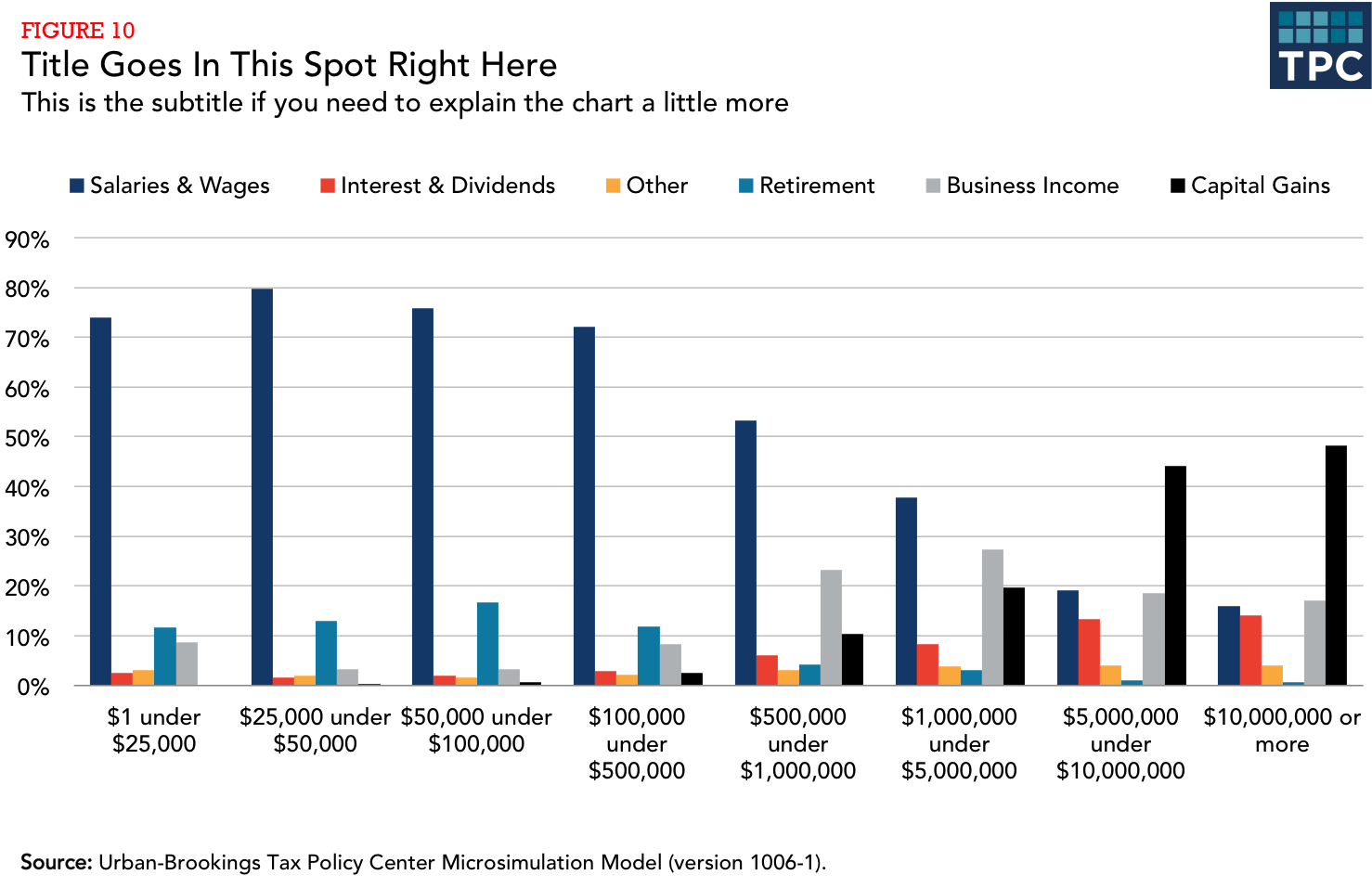
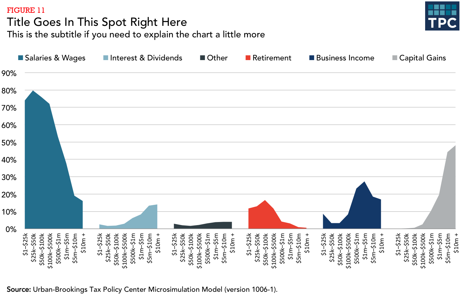
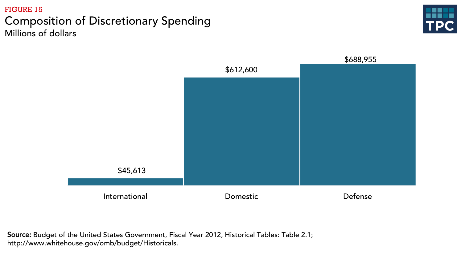
Often, when you want to show composition across several dimensions (usually time), the default choice is a stacked column chart. Though this is not a bad chart type, often a story can be better told by using a different chart.
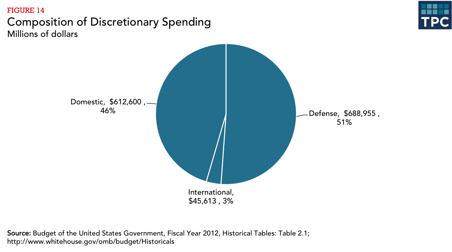
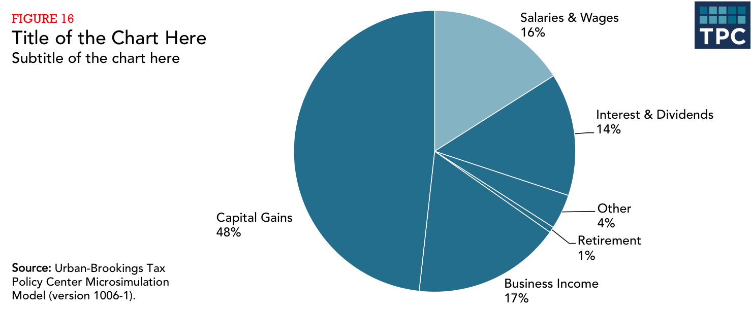
The debate concerning the effectiveness of pie charts is among the most he debate concerning the effectiveness of pie charts is among the most contentious in the field of data visualization. Many people love pie charts—they are familiar, easily understood, and present “part-to-whole” relationships in an obvious way. But others argue that because pie charts force readers to make comparisons using the areas of the slices or the angles formed by the slices—something that our visual perception does not accurately support—they are not an effective way to communicate information.
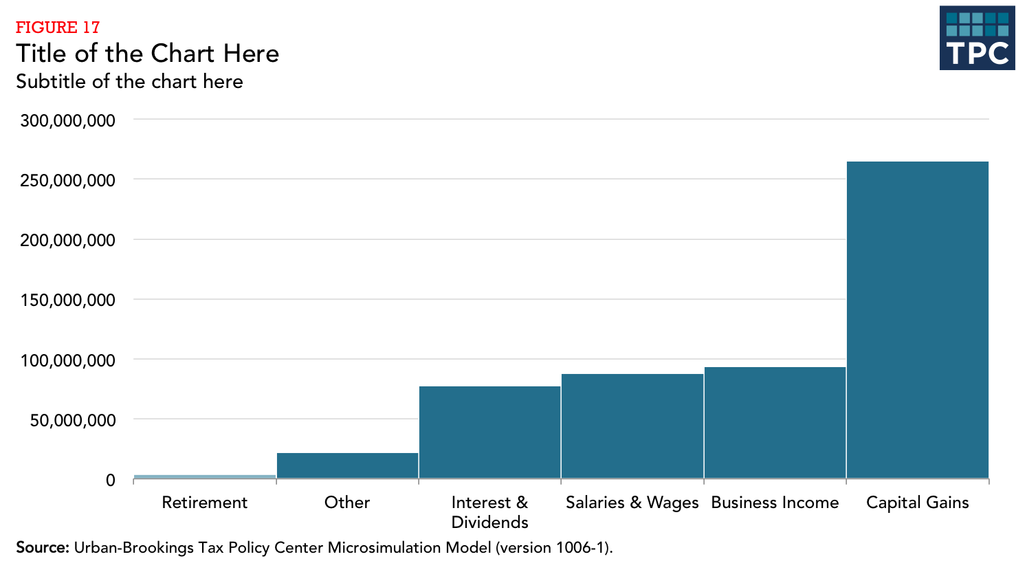
Pie chart slices that form 90-degree right angles—that is, slices that form one-quarter increments—are the most familiar to our eyes. Other amounts are more difficult to discern. For that reason, a column or bar chart is preferable in most cases.
The current thinking is pretty much summed up by this tweet from data visualization pioneer Edward Tufte:
Pie chart users deserve same suspicion+skepticism as those who mix up its/it's, there/their.To compare,use little table, sentence, not pies.
— Edward Tufte (@EdwardTufte) January 10, 2013
That’s not to say that pie charts don’t have a place when communicating research. They're OK to use when the number of slices are fewer than four or five— and when you’re trying to tell a clear ‘part-to-whole’ story about a single slice.
Have a question or looking for more help? Contact Lydia Austin.
Photo from Shutterstock